

The first one shows the cost of healthcare in relation to other industrialized nations. I'm not sure GDP is the right way to measure this as our productivity per capita is higher than most other nations but the disparity between the US and others is so distinct and obvious that it we're talking about rounding errors. A couple of interesting points. First, we are clearly spending more on healthcare than other nations and have done so for a while. Second, that healthcare is a growing percentage of our economy. We are spending more and more on healthcare. Third, while it plateaued for much of the 90s (due to Clinton's budget changes and the formation of HMOs) that plateau has turned into steep increases as of late.
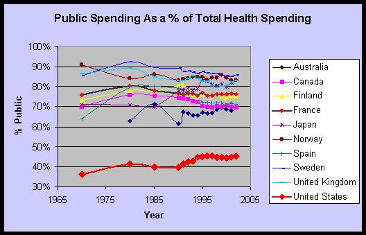
The second interesting chart shows how much the government contributes. This isn't any great surprise since those who have healthcare insurance in the US get it through their employer and those that don't primarily just do without. In the other countries the government has seen fit to pay for healthcare for the masses. In other words we (or our employers) pick up much of this increasing tab.
So for all this spending we much have the best healthcare in the world right? Well a previous post on the site shows that some measures prove this not to be the case - the health of infants and the health of old people.

The first graph shows a number of metrics for infants - mortality rate, underweight at birth, maternal deaths. Any way you cut it, we are bad in comparison. Not off the chart bad, but just the worst of the bunch.
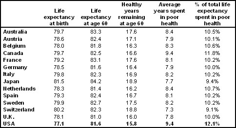
The second graph shows a number of metrics for old people - life expectancy, years spent in poor health, etc. Again we are bad in comparison. Not only do die more quickly but more of our living years are spent in 'poor health'.
What's not detailed on the site is why we spend so much for crappy healthcare. The site is not apt to speculation and will probably bring more data to bear later on. The comments are quite interesting. WHO did release some information relating to what could be some of the reasons.
- Minorities and the poor have extremely poor health more characteristic of developing countries.
- HIV, surprisingly, takes 3 months off the life expectancy of male babies in 1999
- Also surprisingly the US is one of the leading countries for cancers related to tobacco (I always envisioned Europeans as bigger smokers)
- High coronary heart disease
- High levels of violence leading to death
1 comment:
Great blog and information on the best healthcare. Very informative and great help as im looking for better health coverage.
Post a Comment